We met with the client in person and discussed the logo design brief. Here is a summary from the client on what the logo design should be:
“Simple and clean. I am going for a very professional yet fun and young image”
After a one hour meeting, we had developed a good idea of what the client’s business was about, what he wanted to achieve and what image the logo needed to present to his market. We created a document detailing the information for our logo designers and artists, and got to work.
We brainstormed one Friday morning, coming up with sketches and ideas for inspiration for this logo design. Here are a few ideas we came up with, and how they were developed.
1. VMA initials: The client wanted to see one concept using the intials of the company as the main image of the logo. The letter “VMA” are very similar in linear style, so we displayed them together with a custom font. Adding a slight gradient to the lettering and giving it a black background added that professional feel to the logo.
2. Circle mark, universal sign for victory: The inspiration for this logo came from the universal symbol of victory; the index finger and the middle finger pointed up together turned forward. We created a minimal and modern design for this symbolsim and enclosed it in a circle to balance the overall mark of the logo.
The victory symbolism also used the shape of the “V” in victory so it was used as an image with double purpose.
3. Font, and style: The third concept was a more text based identity, using a more stylish typeface.
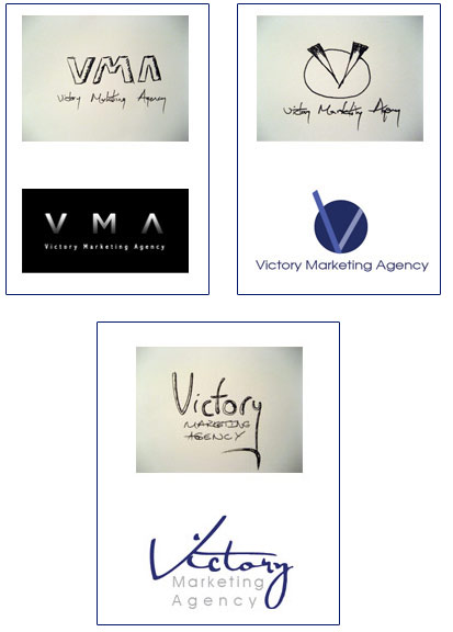
The client chose the circle mark logo with the company name below as the preferred logo design to bring into the revision stages.
We agreed that this logo was the one that matched the brief perfectly and would allow us to really develop the concept into something special through revisions.
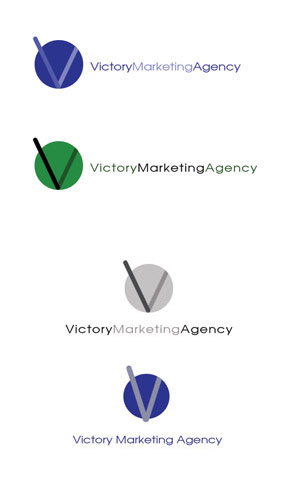
After more development and concept ideas came together, we hit it right on the mark!
We further enhanced the concpet of the victory symbol and the large “V”, and then we added another piece of inspiration to this concept.
Victory Marketing Agency will be a leading event staffing agency, so…with this in mind, we started to think about events, and staff, and what imagery and inspiration we could pull from this service.
The victory symbol of the two fingers, along with the “V”, provided the platform for the final piece to be added to the logo. Spotlights are a popular feature at events of all sizes, and instantly recognizable when beaming into a night sky. We added a bit of gradient styling to the logo and voila! We had a subtle spotlight symbol! The logo was done and the client was very happy with the outcome.
Like this logo and how it was developed? We can provide you with the same level of creativity and expertise in logo design. Contact us now
